12 Classic Squarespace & Canva Compatible Font Combinations For Your Website
You may have heard of the KNOW, LIKE, TRUST factor in marketing and building your brand loyalty & recognition. Keeping your visuals consistent across all your client touchpoints will help you with this important trifecta that keeps your business memorable and trusted.
If you’re not a graphic designer and fluent in Adobe or Figma programs, chances are you’re using Canva to create marketing graphics for your business - anything from presentations, freebie opt-ins, Instagram & Facebook posts, Pinterest Pins, the list goes on.
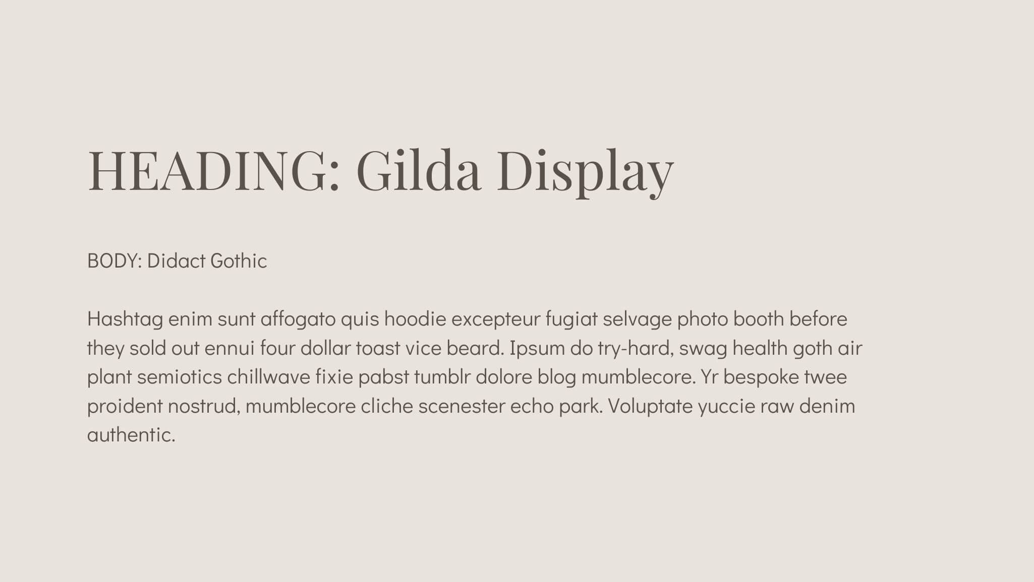
Canva offers hundreds (maybe thousands??) of amazing fonts for your graphics so there is no shortage of beautiful type choices. However, if you want to keep your brand touchpoints consistent AND don’t want to pay for a custom font, then choosing a font pair that is available in both Squarespace & Canva is key.
As a sidenote, you can choose any font you love from a variety of Type Foundries and then use those on your website and in Canva. You will need a Web License for use on your website and also a Desktop License for use in Canva. Make sure you’re reading the fine print to keep things legal.
Creative Market is one of my favourites to scour for new ideas!
Which font pairing is right for you?
Before we go any further, it’s important to understand how different styles of type, often referred to as ‘fonts’ create an emotive quality. The wrong font choice can drive away your ideal clients rather than pull them in.
Each of these pairings has a particular vibe, so keep your brand strategy in mind. This means going back to your mission, vision, values and dream client profile to ensure that the fonts are also related back to this strategy.
Sub-headings are also a great add-on to your type hierarchy to create interest and chunk text.
I didn’t touch on sub-headings for each font pair below, but you can also use your body or heading font for this. Generally, I recommend that sub-headings be a sans-serif font.
If your body font is serif, I would recommend using your sans-serif heading font and if your body font is already sans-serif then use that. Best practice is to use ALL CAPS, a font-weight or two heavier and a wider letter spacing (eg. 0.02em vs 0em). This is in lieu of a third font. Often, your buttons will also mimic this design for consistency.
Example of my type layout for reference
Headings: Chromate
Sub Heading: Commuters sans (BUT YOU WOULD DO THIS IN sofia pro TO REFERENCE THE ABOVE suggestion WITH 2 FONTS)
Body: Sofia Pro
let’s get into it
Top font pairs for a classic website design
This combination can be found on a website I designed for Casey Diehl Beauty
The Travelista uses this combination on her website along with custom script font, Amalfi Coast
This is by no means an exhaustive list. If you find a font on Canva you love, chances are you can find the Web License on Creative Market and only have to invest in the web version.
Which one is your favourite?
Need help with your design project? Book a Clarity Call to see what’s best for you!
Disclaimer: I may make a small commission off links shared in this post


